/home/shinyama/work
C のとき…
A への相対パス名を答えよ。
M への相対パス名を答えよ。
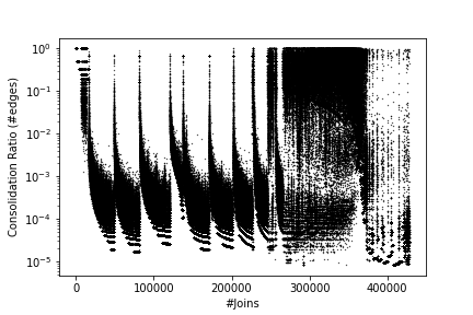
/home/john とする:今回は、論文の図3 を描くことを考える:
このようなグラフは「散布図」と呼ばれている。matplotlib を使って
このグラフを描くには、前回のつづき (kadai-plot-data フォルダの
データを使って図を描いた状態) で、以下のように入力する:
import numpy as np
import matplotlib.pyplot as plt

a = np.genfromtxt("./drive/My Drive/kadai-plot-data/cnm/ratio-join.txt")
plt.scatter(a[:,0], a[:,1], s=0.1, color="black")

plt.xlabel("#Joins")
plt.ylabel("Consolidation Ratio (#edges)")
plt.savefig("fig3.pdf")
plt.show()
ここには 2つの問題がある:
fig3.pdf) をダウンロードすると、
時間がかかるうえ、ファイルサイズが巨大 (約1.9MBytes) もある。
これは、非効率である。
画像ファイルが巨大なのは、
これがPDF形式 (fig3.pdf) であることによるものである。
このため、描画も非常に時間がかかってしまう。
fig3.pdf を実際に
ダウンロードして拡大せよ。
fig3.pdf から fig3.png に変更せよ。
できたファイルをダウンロードし、違いを確認せよ。
plt.yscale("log")
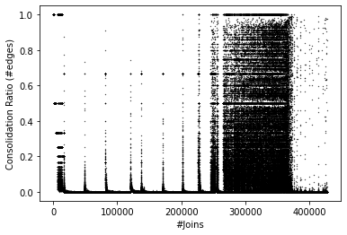
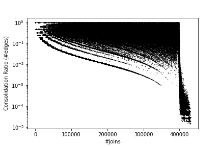
これまでに学習したことを使えば、 論文の図をすべて描くことができる:
論文のグラフ 図2 〜 図6 の画像ファイル、 およびそれを生成する matplotlib のプログラムすべてを 1個の zipファイル にまとめ、提出せよ:
 |
|
 |
 |
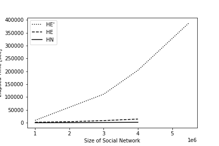 |
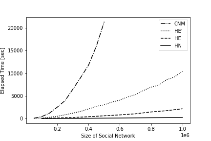
| 図2 | 図3 | 図4 | 図5 | 図6 |
以下、描き方に関する説明:
cnm/ratio-join.txt ではなく、
hn/ratio-join-500K.txt を使えばよい。
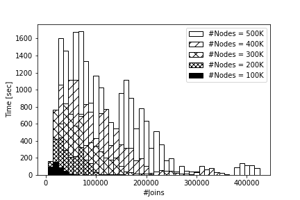
図2 だけは特別で、これは以下のプログラムを使って 棒グラフ (bar) を 5回表示させればよい:
import numpy as np
import matplotlib.pyplot as plt

a = np.genfromtxt("./drive/My Drive/kadai-plot-data/cnm/time-join-500K.txt")
plt.bar(a[:,0], a[:,1], 10000, edgecolor="black", color="???", label="#Nodes = 500K")

a = np.genfromtxt("./drive/My Drive/kadai-plot-data/cnm/time-join-400K.txt")
plt.bar(a[:,0], a[:,1], 10000, edgecolor="black", color="???", hatch="???", label="#Nodes = 400K")

a = np.genfromtxt("./drive/My Drive/kadai-plot-data/cnm/time-join-300K.txt")
plt.bar(a[:,0], a[:,1], 10000, edgecolor="black", color="???", hatch="???", label="#Nodes = 300K")

a = np.genfromtxt("./drive/My Drive/kadai-plot-data/cnm/time-join-200K.txt")
plt.bar(a[:,0], a[:,1], 10000, edgecolor="black", color="???", hatch="???", label="#Nodes = 200K")

a = np.genfromtxt("./drive/My Drive/kadai-plot-data/cnm/time-join-100K.txt")
plt.bar(a[:,0], a[:,1], 10000, edgecolor="black", color="???", label="#Nodes = 100K")

plt.xlabel("#Joins")
plt.ylabel("Time [sec]")
plt.legend()
plt.show()
ここで、color="???" の ??? 部分には、
white あるいは black のどちらかを入れる。
hatch="???" の ??? 部分には、
//、xx あるいは xxxx のどれかを入れると、
論文にあるのと同じ模様でグラフが描画できる。
生成する画像ファイルはすべて png形式とする。 これに加えて matplotlib の各プログラムを txt形式のファイルで保存し、 これらをひとつのフォルダの中に入れる:
できあがった kadai1.zip を OCW-i で提出すればよい。
x^2 + y^2
\sqrt{x^2 + y^2}
\frac{x}{y}
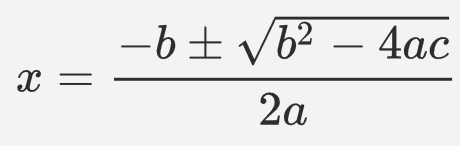
x = \frac{-b \pm \sqrt{b^2-4ac}}{2a}
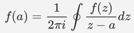
f(a) = \frac{1}{2\pi i} \oint\frac{f(z)}{z-a}dz
今回は、Overleaf というサイトを使って LaTeX 文書を作成する。
自分の PC にインストールしたい場合は、 以下を参照のこと:
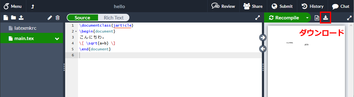
hello と入力する。
latexmkrc と入力する。
(注意:
latexmkrc.tex はダメ、.tex の部分を消すこと)
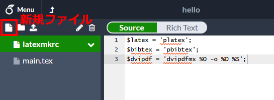
latexmkrc をクリックし、編集画面で以下の文字をペーストする:
(赤線が表示されても気にしない)
$latex = 'platex';
$bibtex = 'pbibtex';
$dvipdf = 'dvipdfmx %O -o %D %S';
main.tex をクリックし、編集画面で以下の文字をペーストする:
\documentclass{jarticle}
\begin{document}
こんにちわ。
\[ \sqrt{a + b} \]
\end{document}
詳細は 上に書いた。
論文のグラフ 図2 〜 図6 の画像ファイル、
およびそれを生成する matplotlib のプログラムすべてを
1個の zipファイル にまとめ、提出せよ。
ファイル名は kadai1.zip であること。
Zip の中には計10個のファイル (fig2.png, fig2.txt, ...,
fig6.png, fig6.txt) が含まれていなければならず、
採点基準は 1つのファイルにつき 2点 (全部で20点) である。
演習 4-3. で作った PDF ファイルを提出せよ。
内容は、LaTeX を使ってあれば何でもよいので、
べつに好きな数式なり文章なりを入れてもかまわない。
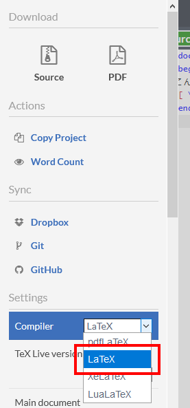
(Overleaf のかわりに、自分の PC にインストールした LaTeX を使ってもよい。)
ファイル名はなんでもよいが、拡張子は .pdf であること。